
BODY ENSOUL
Project: Client Project
Type: Visual Identity
Role: Designer
Year: 2024
Creative Suite:


The founder of Body enSoul, wanted to create a visual identity that embodied her holistic and empowering approach to fitness, combining strength training with yoga. However, in her small town near the NSW and Victoria border, where everyone knew her as the head group facilitator at the local gym, she felt limited by this identity.
She wanted to break free and establish her own brand that truly reflected her passion and unique philosophy. To stand out in a competitive market and attract new clients to her distinct sessions, she required an identity that included a logo, colours, typography and more to capture the essence of Body enSoul—strength, balance, and a holistic approach to personal training.
BALANCE OF HEALTH
-
The process began with a client call, during which we discussed a range of questions about her personal training business, her goals, and her values. This conversation was crucial in helping me understand what further research would be needed to build her brand. Founder of Body enSoul emphasized her desire to be different, the importance of her values, and her insistence on incorporating purple into her brand. With this direction, I began researching industry trends, customer behaviours, and how fitness brands connect with consumers, allowing me to refine the messaging and colour choices.
The preference for purple prompted additional research to ensure that this colour aligned with her core values and the spirit of her business. Armed with insights and some resources provided, I sketched out a series of logo concepts that reflected her brand’s balance of strength and spirituality. She also wanted the Ulmone symbol, representing "journey," to be integrated into the design, which I conveyed through the use of lines and dots to symbolize movement and progress.
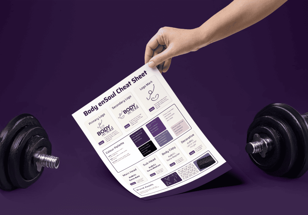
From the various logo designs, the founder selected one that resonated with her, which I further refined into the final primary mark. This process led to the creation of a visual identity "family," where colours and typography were chosen to represent the empowering nature of her brand. Since Body enSoul was starting as a small independent business, it was important to keep the brand elements accessible and flexible. The typeface "Saira" was selected for its modern, clean lines, perfectly fitting the brand’s approachable yet strong personality.
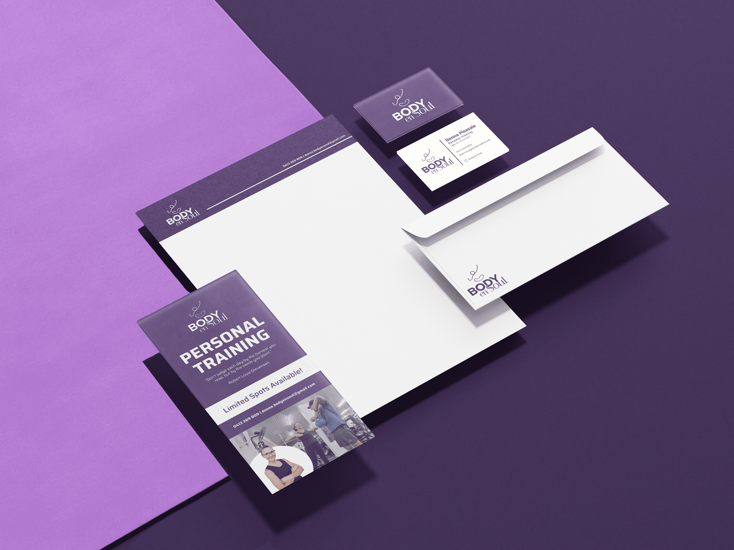
Once the logo and colour palette were finalised, I crafted the brand guidelines along with additional collateral, including business cards and flyers for her promotional efforts. Along the way, unused sketches inspired the creation of custom icons and patterns, adding variety and consistency to her brand’s visual touchpoints.
To help launch Body enSoul and transition away from her current gym, I also created a launch video. This video not only introduced her brand but also marked the beginning of her exciting new journey as a personal trainer building something entirely her own.


“I do really love the play on unilome and figure against the text. It highlights the journey I take individuals on to find their own balance of health that sustains them in the long run. ”
- Donna

Empowering Calm Holistic Strong
“Chloe was incredibly dedicated, thorough, and an absolute perfectionist. Her hard work and talent has turned my vague idea into something I am very proud of and motivated to use. Thank you Chloe for providing the boost and inspiration my business needed.”
- Donna